Patryk Kaminiecki

“For anyone looking for outstanding analysis, visualisations, and actionable insights, I highly recommend reaching out to him. His ability to transform complex data into clear, compelling visuals makes him a fantastic asset in any data-driven environment.”
— Anna Balandynowicz, Head of Fund Admin Regulatory Change, SS&C Technologies
🚀 Projects
1. Savings Compass — Polish Bonds Savings Planner [React, JavaScript]
✍️ A bilingual (PL/EN) interactive savings planner that ranks all Polish Treasury savings bonds (ROR, DOR, TOS, COI, EDO, ROS, ROD) plus a benchmark savings account against a user’s goal, amount and horizon. Inspired by the work of Marcin Iwuc.
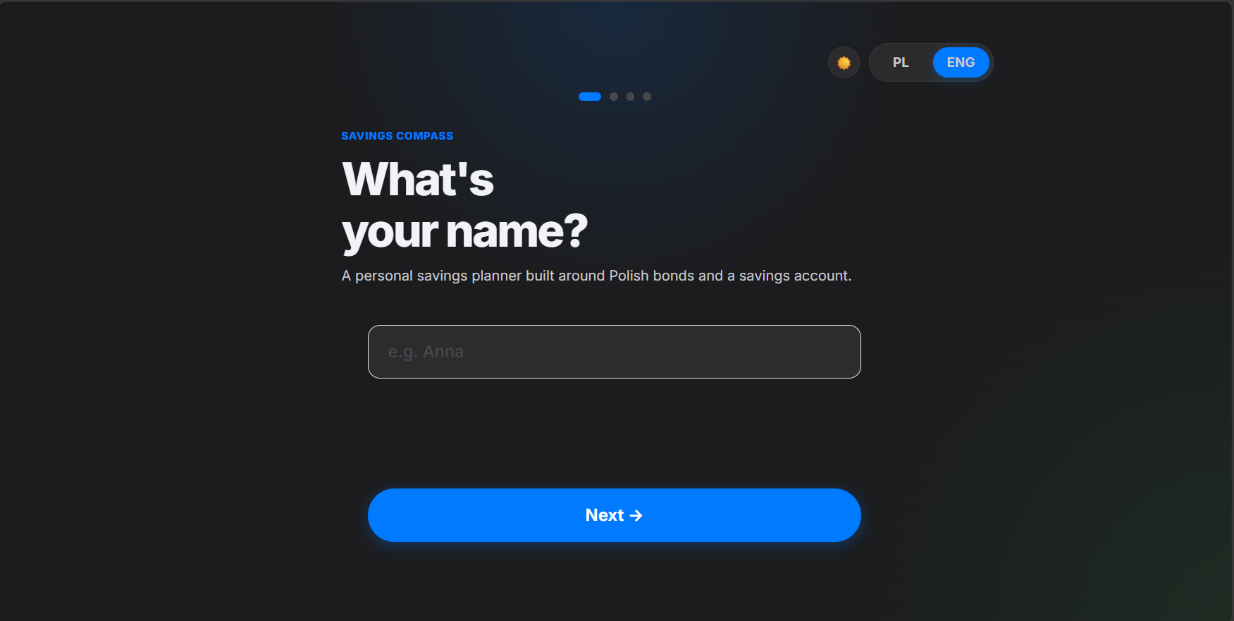
- Personal flow: 4-screen onboarding (name → goal → amount → horizon) with multi-goal comparison and inline editing.
- Financial engine: Month-by-month simulation including capitalization vs. payout, series rollover, early-redemption fees, Belka tax and a parallel savings-account benchmark.
- What-if scenarios: Live recalculation when the user adjusts inflation, NBP reference rate or savings-account rate.
- UX: Apple-inspired design system, dark/light mode, fully responsive single-file React app (no build step).
🔎 Demonstrates skills in product thinking, financial modeling, React and turning a personal-finance problem into a polished consumer tool.
2. Plant Co. Performance Dashboard [Power BI]
✍️ An interactive Power BI dashboard analyzing Plant Co.’s performance over three years, with a focus on profitability trends across products, geographies, and time.
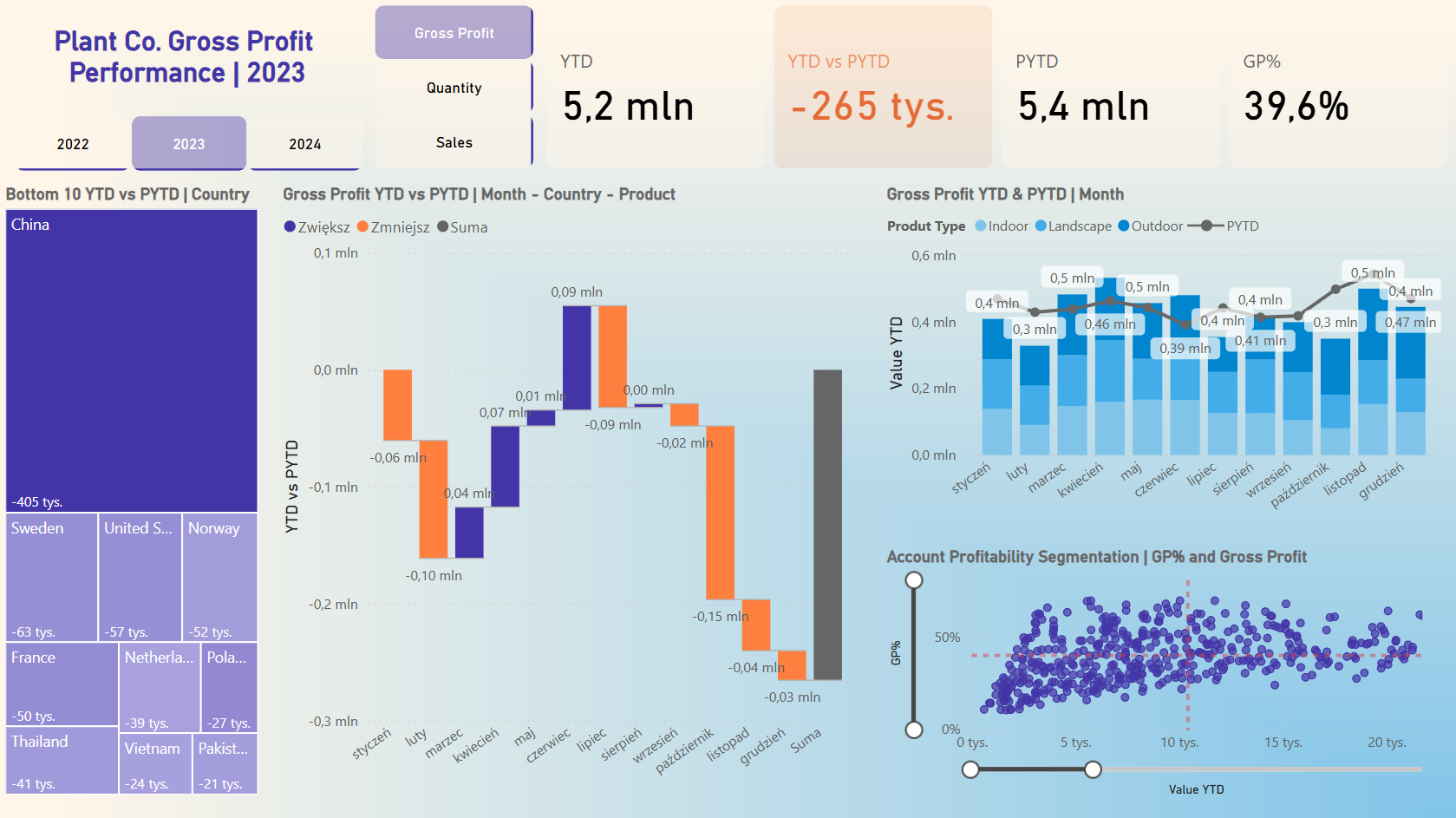
- Performance Overview (YTD vs PYTD): Tracks Gross Profit, Quantity, and Sales with variance analysis to highlight growth or decline.
- Market Insights: Identifies underperforming countries via treemaps and visualizes monthly KPI shifts with waterfall and line charts.
- Segmentation: Breaks down profitability by product type (Indoor, Outdoor, Landscape) and categorizes accounts by GP% for strategic decision‑making.
🔎 Delivers actionable insights for optimizing sales strategies, refining market focus, and improving product performance. Demonstrates skills in Power BI data modeling, DAX, and advanced visualization design.
3. Sales Performance Dashboard [Power BI]
✍️ An interactive Power BI dashboard providing a high‑level overview of global sales performance, market distribution, and order prioritization.
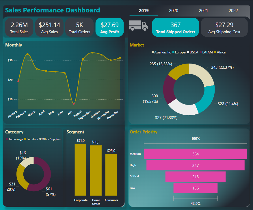
- Key Metrics: Tracks total sales, average sales, total orders, profit per order, shipped orders, and shipping costs.
- Visual Insights:
- Line chart of monthly sales trends with min/max values.
- Pie and doughnut charts breaking down markets and product categories (Technology, Furniture, Office Supplies).
- Bar charts highlighting performance across business segments and ranking order priorities.
🔎 Demonstrates skills in Power BI, advanced DAX calculations, and dynamic visualization design. Supports decision‑making by identifying market opportunities, optimizing order strategies, and improving profitability.
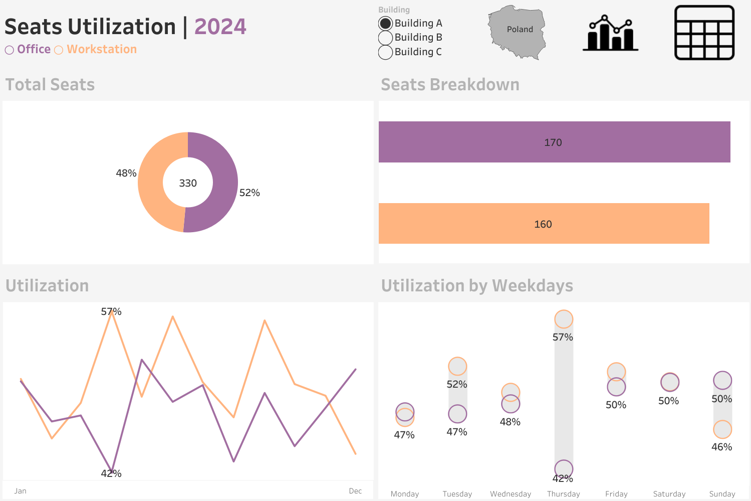
4. Seats Utilization Dashboard [Tableau]
✍️ A Tableau dashboard designed to monitor workspace occupancy across multiple office locations in 2024, providing actionable insights for space optimization and resource planning.
-
Summary View: Tracks total seat utilization, usage trends over time, and weekday comparisons to identify peak and low occupancy periods.
-
Detailed Analysis: Offers seat‑level utilization tables with advanced filters by building, room type, and location, plus a utilization slider to spotlight under‑ or over‑used areas.
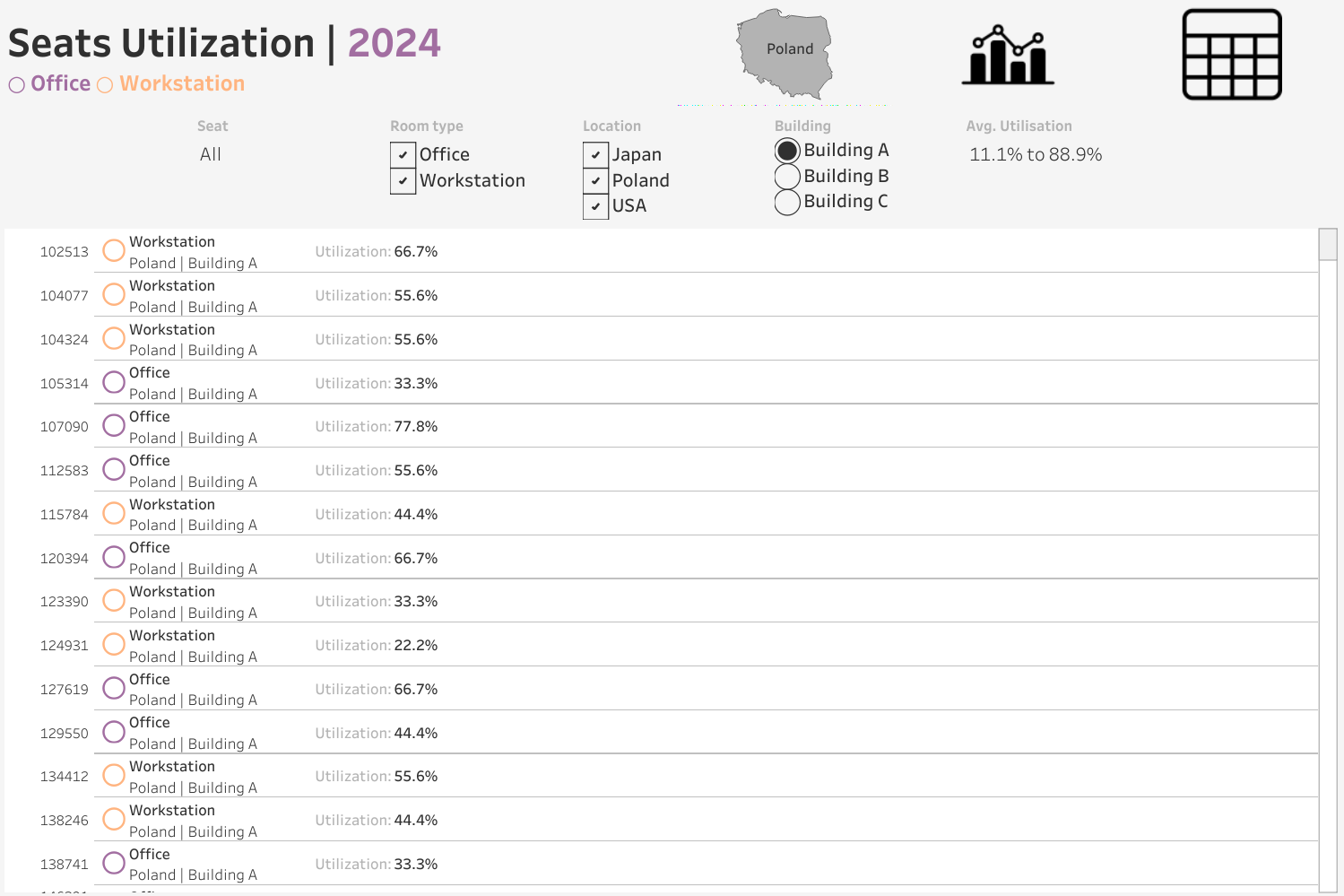
🔎 Helps facility managers and executives optimize office space allocation, reduce costs from under‑utilized areas, and make data‑driven decisions to improve workplace efficiency.
5. Sales and Customer Dashboard [Tableau]
✍️ Two interactive Tableau dashboards designed to analyze customer behavior and sales performance with year‑over‑year comparisons.
-
Sales Dashboard: Monitors sales, profit, and quantity, breaks down results by product subcategories, and visualizes weekly sales and profit trends.
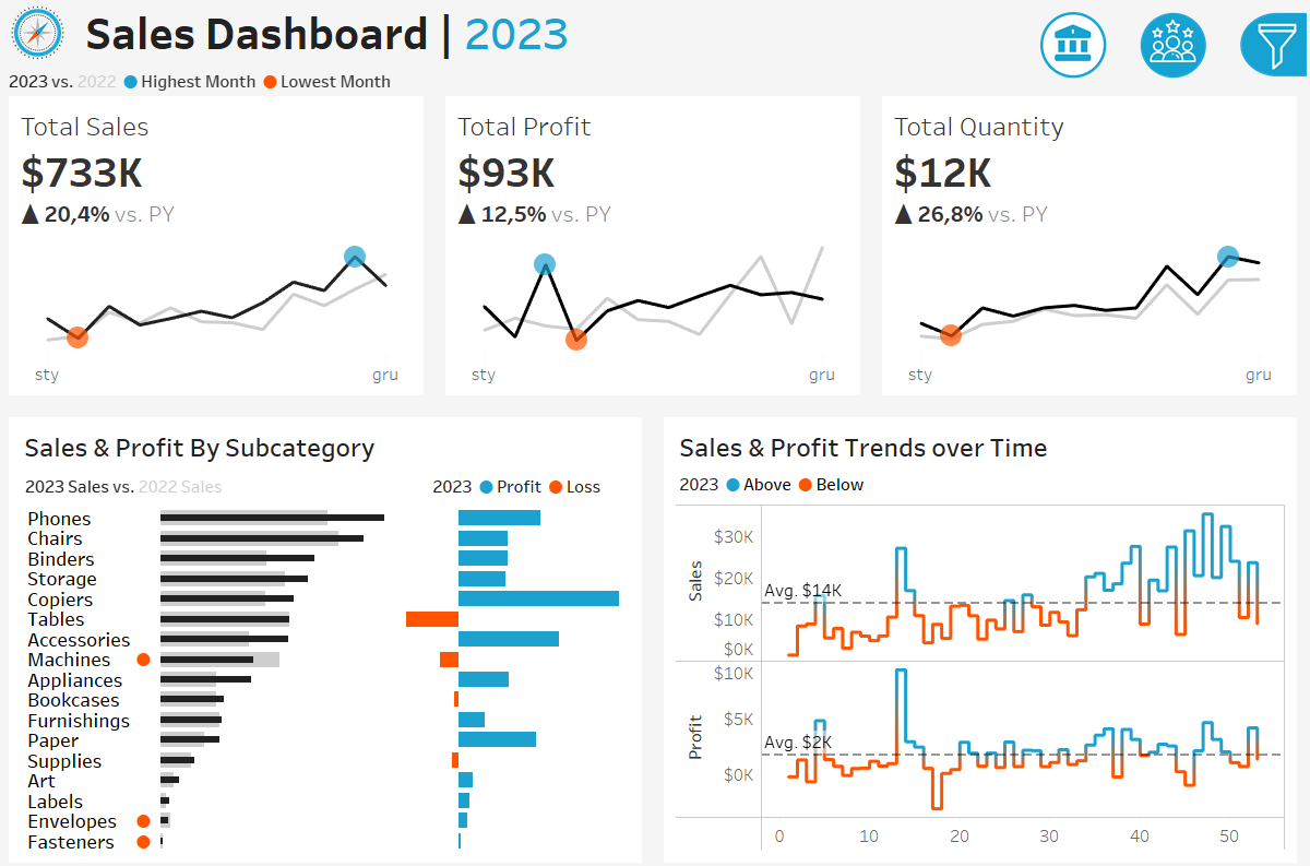
-
Customer Dashboard: Tracks total customers and growth trends, segments buyers by order frequency, and highlights the top 10 most profitable clients.
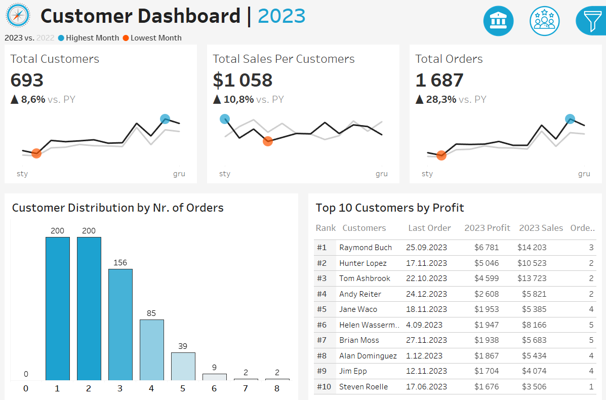
🔎 Demonstrates skills in data preparation, interactive dashboard design, and visual storytelling to support business decision‑making.
6. Coffee Sales Dashboard [Excel]
✍️ An interactive Excel dashboard designed to analyze coffee sales across time, product categories, and regions. A recreation of Mo Chan’s Coffee Dashboard, built to demonstrate advanced Excel features such as pivot tables, slicers, and dynamic formulas.
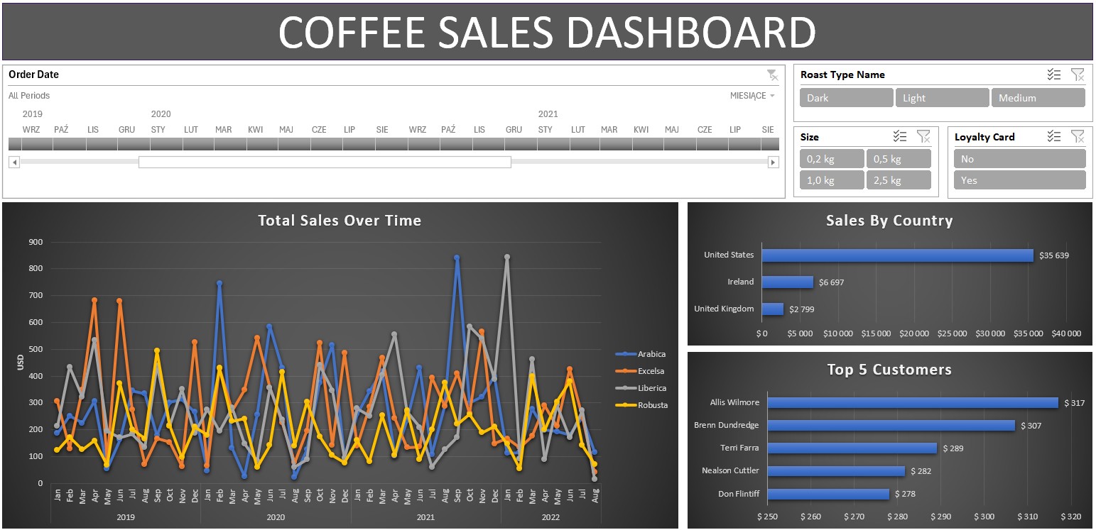
- Sales Overview: Tracks total revenue, units sold, and average transaction value, with breakdowns by product type and region.
- Trend Analysis: Visualizes sales performance over time, highlights seasonal patterns, and compares product contributions.
🔎 Demonstrates skills in Excel data modeling, interactive dashboard design, and clear visual storytelling to support business decision‑making.
📝 About Me
💼 Experience
Business Analyst — Banqsoft, Gdańsk (2025–Present)
Building solutions for the financial services industry alongside Product and Engineering. Translate client needs into delivered features for banks and finance institutions.
Reporting Analyst — State Street, Gdańsk (2022–2025)
Modernized legacy reporting into automated, decision-ready Power BI and Tableau systems for global stakeholders.
- 1 week → 1 hour — automated a multi-source consolidation report (-99% time, zero manual errors).
- Hours → minutes — built a global portfolio reporting model with end-to-end Power Query ETL.
- Engineered a global office-space utilization dashboard for senior leadership.
Business Analyst — State Street, Gdańsk (2019–2022)
Led EMEA-wide BA work on technology implementations and reporting platforms.
- -70% manual errors across EMEA tech implementations.
- -30% onboarding time via end-to-end documentation and training.
- +50% dashboard usability through iterative Power BI improvements.
Fund Accountant — State Street, Gdańsk (2015–2019)
The foundation of everything I now build in BI. Owned daily NAV production for a portfolio of client funds.
- -40% risk assessment time through fund-performance KPIs.
- 99% pricing accuracy across periodic valuation audits.
Verification Specialist — Transcom Worldwide, Gdańsk (2010–2015)
Verification work for Citi Handlowy credit card sales.
- 98% data validation accuracy across high-volume verification projects.
- Designed an internal case-tracking system — response time -40%, backlog -50%.
🎓 Education
- Master’s degree, Accounting and Finance — University of Gdańsk (2009–2014)
🛠️ Technical Skills
- Data Visualization: Power BI, Tableau
- Data Management: SQL, Power Query, ETL Process Design
- Productivity Tools: Excel (Advanced)
- Domain: Fund Accounting, Financial Reporting
- Methodologies: Agile PM, Stakeholder Engagement
🌐 Languages
- Polish (Native)
- English (Advanced – C1)
📜 Certifications
- SQL Programming (NASBA, 2024)
- SQL Essential Training (NASBA, 2024)
- Tableau Essential Training (NASBA, 2024)
- Data Visualization for Data Analysis and Analytics (IIBA, 2024)
- Change Management Foundation (APMG International, 2019)
- AgilePM Foundation (APMG International, 2018)
- Financial Controller (MEN, 2016)
- Master of Excel (2015)